


These maps are crucial for understanding the region's history, its present, and some of the most important stories there today.
Get Started for FREE
Sign up with Facebook Sign up with X
I don't have a Facebook or a X account


 Your new post is loading...
 Your new post is loading...
Your new post is loading...
These maps are crucial for understanding the region's history, its present, and some of the most important stories there today. 
|

Every Wikipedia entry has an optional feature we take for granted--geotagging. An entry on the Lincoln Memorial will be linked to its specific latitude and longitude in Washington D.C. On any individual post, this may or may not be a useful thing. But what about looking at these locations en masse? That was a question asked by data viz specialist and programmer Olivier Beauchesne. To find out, he downloaded all of Wikipedia (it’s open-source, after all) then used an algorithm that would assemble 300 topical clusters from popular, related keywords. Then he placed the location of each article in these topical clusters on a map. What he found was astounding... Via Lauren Moss
|


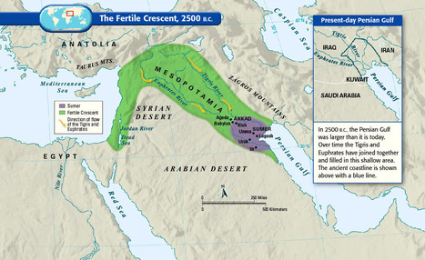
Maps like the ones posted in this article, really helps people to understand and break down deeply of understanding the entire region as a whole. Visualization is very important in geography when trying to understand the region people are talking about. this region as goes down to the Mesopotamia Era. It is important to know, how the culture was in this area to how it differentiated during the Ottoman Empire. During the first couple of maps, we can begin to see the division of the entire region. As you go on, we begin to notice the divisions between people, religion, language between states and in-states. There is so much information to know about the Middle East region and it may be even harder to understand due to the tons of changes and separations, but it is important to understand these divisions like the Sunni's and the Shi'ites in order to fully explain the development and the current situations that are occurring in this region as we speak.
These 40 maps are a very interesting way of showing how people have traveled around and moved about the Earth from the time of the fertile crescent era to the people of today. It shows us the paths that people have taken to move to a new location. How they used the Meditteranean Sea to move from one side to the other. It also shows how the Tigris and Euphrates came together to form a smaller area of the Persian gulf. This led to smalled economic growth because now there is less land for imports and exports.