


Un dessin vaut mieux que de long discours. Le refrain est connu. Le développement de l'usage des infographies dans la presse , dans les médias, dans l'édition ces dernières années est une tendance lourde.
Get Started for FREE
Sign up with Facebook Sign up with X
I don't have a Facebook or a X account


 Your new post is loading...
 Your new post is loading...
Your new post is loading...
Un dessin vaut mieux que de long discours. Le refrain est connu. Le développement de l'usage des infographies dans la presse , dans les médias, dans l'édition ces dernières années est une tendance lourde. 
|
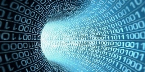
A simple Google image search on “big data” reveals numerous instances of three dimensional one’s and zero’s, a few explanatory infographics, and even the interface from The Matrix. So what does “big data” look like, within human comprehension? From the beginning of recorded time until 2003, humans had created 5 exabytes (5 billion gigabytes) of data. In 2011, the same amount was created every two days. It’s true that we’ve made leaps and bounds with showing earlier generations of data. However, when it comes to today’s big data, how it looks can help convey information but it needs to be more than just beautiful and superficial. It has to work, show multiple dimensions, and be useful. New software and technologies have enabled us to gain higher level access to understanding these enormous sets of data. However, the only way we’re going to truly gather and juice all the information big data is worth is to apply a level of relatively unprecedented data visualization. How do we get to actionable analysis, deeper insight, and visually comprehensive representations of the information? The answer: we need to make data more human. Via Lauren Moss

Ron Leunissen's curator insight,
January 13, 2014 7:27 AM
Drinking from a fire hose is not possible. Neither is reading in a data stream of about 2,5 billion gigabytes per day! 
Andreas Maniatis's curator insight,
January 13, 2014 12:05 PM
How do we get to actionable analysis, deeper insight, and visually comprehensive representations of the information? The answer: we need to make data more human. |


Pour mieux mémoriser, mieux comprendre des informations, notamment statistiques ou géographiques rien de mieux qu’un diagramme, une cartographie ou un schéma explicatif. Rien de mieux qu’une bonne infographie.
Pour mieux mémoriser, mieux comprendre des informations, notamment statistiques ou géographiques rien de mieux qu’un diagramme, une cartographie ou un schéma explicatif. Rien de mieux qu’une bonne infographie.
Pour mieux mémoriser, mieux comprendre des informations, notamment statistiques ou géographiques rien de mieux qu’un diagramme, une cartographie ou un schéma explicatif. Rien de mieux qu’une bonne infographie.